Corita Kent: Footnotes and Headlines
In her bold graphic prints, the artist Corita Kent proposed “a new form of praying . . . through the words and phrases and headlines and ads and footnotes that surround us.” Frances Elizabeth Kent (1918–1986) was born in Fort Dodge, Iowa, adopting the name Sister Mary Corita when she joined the Sisters of the Immaculate Heart of Mary (IHM) in Los Angeles in 1936. A student of art and art history, Kent learned silkscreen printing in 1951 and was soon showing her serigraphs at galleries around the country. Kent also taught in the art department at Immaculate Heart College, introducing her students to galleries exhibiting avant-garde artists, including the 1962 Los Angeles debut of Andy Warhol’s iconic pop art Campbell’s soup cans.
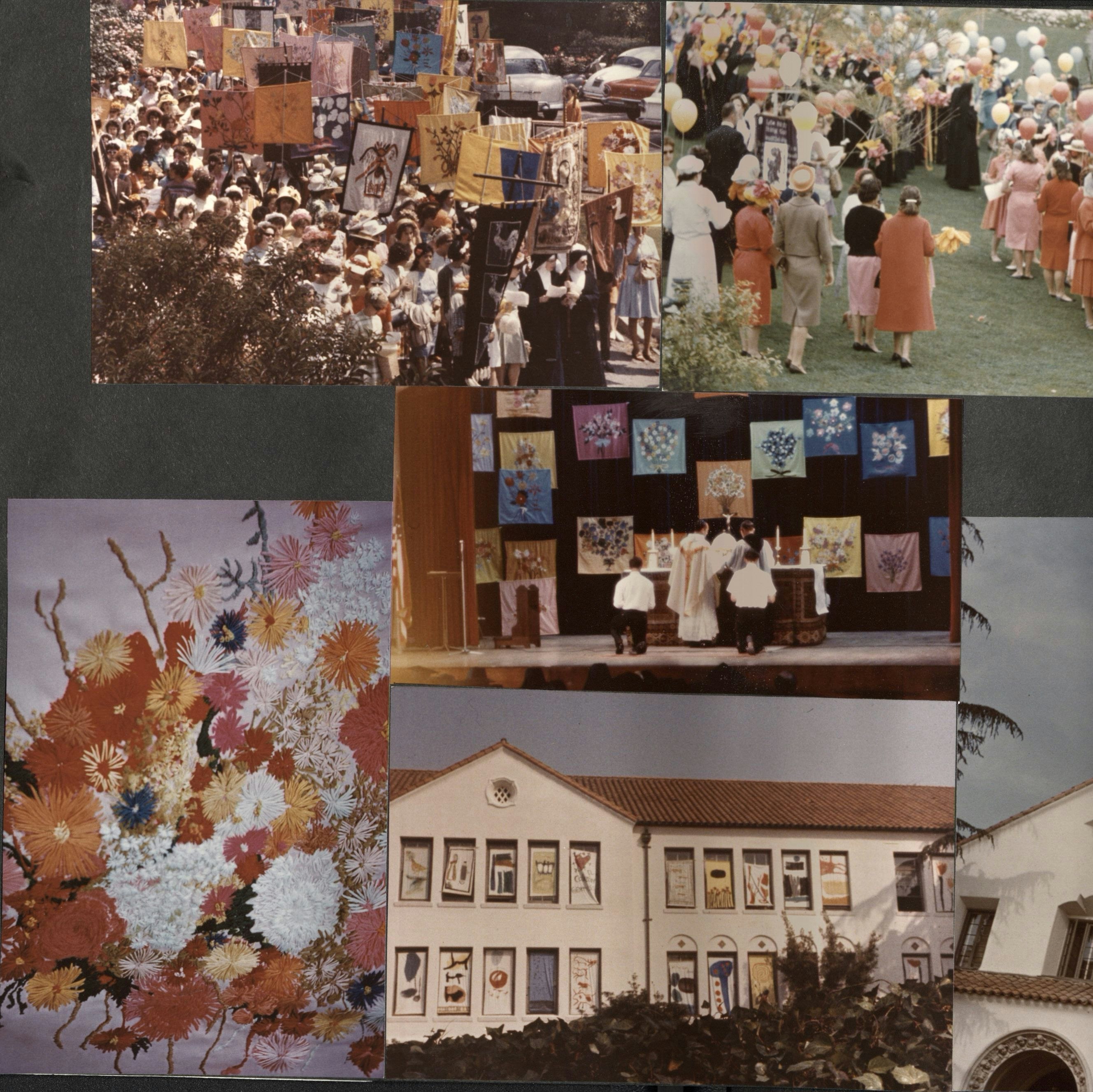
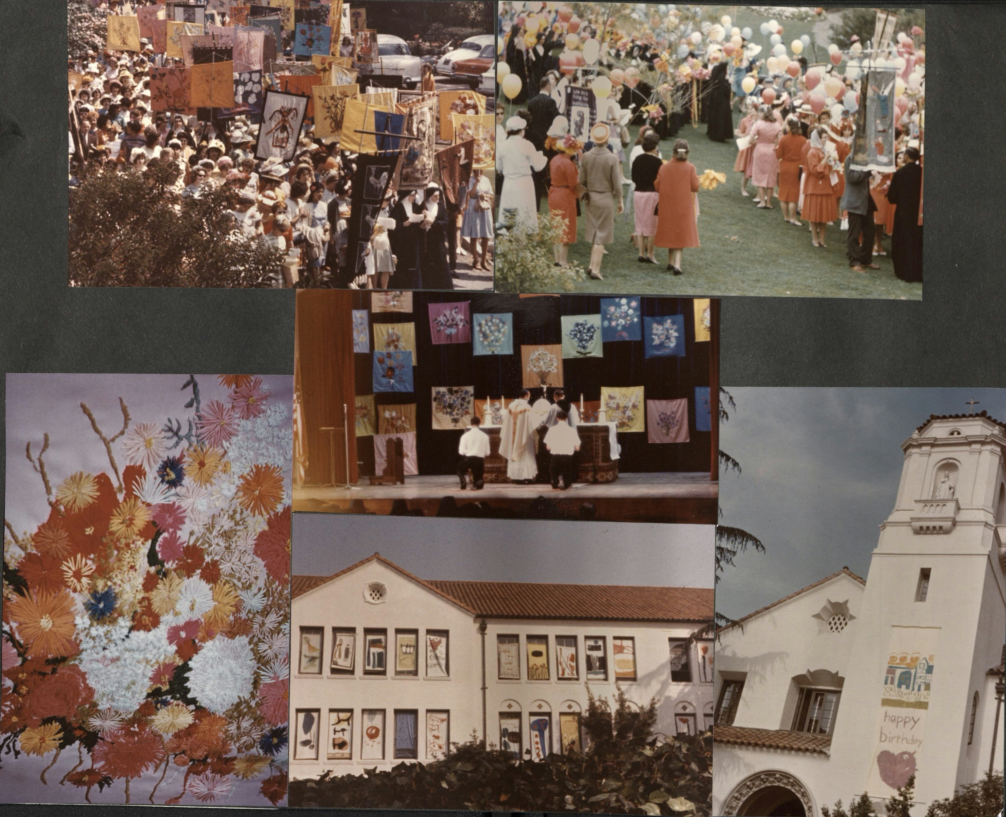
That same year saw the advent of the Second Vatican Council, charged with updating the Catholic Church for the modern world. In addition to recommending changes such as the use of the vernacular rather than Latin during Mass, the council also encouraged orders like the IHM to reevaluate their mission and purpose. Kent and the Immaculate Heart College art department eagerly took up this charge, addressing issues such as hunger, poverty, and war through large-scale art installations and transforming the once solemn celebration of Mary’s Day into a colorful, happening-like parade. It was in this context that Kent made some of her most well-known prints, using the vernacular language of advertising slogans, popular songs, and literary texts to proclaim her version of a modern, updated Catholicism deeply committed to social justice, civil rights, and peace. Finding herself at odds with the conservative archbishop of Los Angeles, Kent left the order and moved to Boston in 1968. There, she continued to work as an artist, completing her monumental Rainbow Swash gas tank in 1971.
This exhibition explores Kent’s teaching, artistic process, career, and activism, all of which disrupted the dichotomies of fine/commercial art and religious/secular art.
Teaching
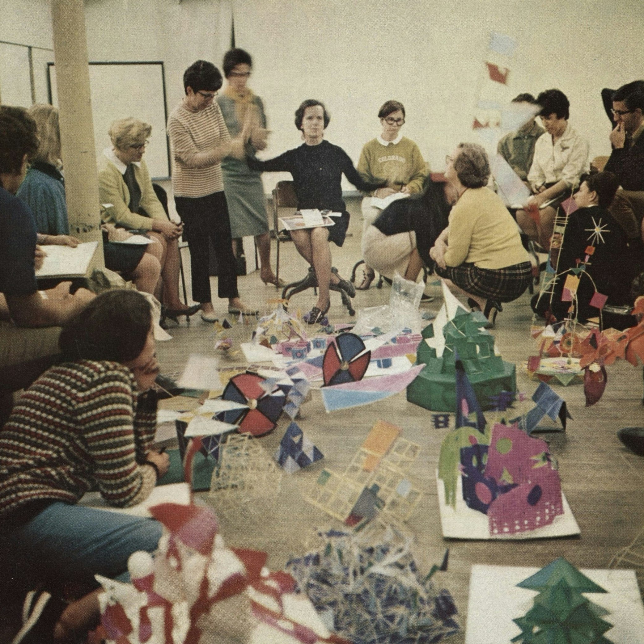
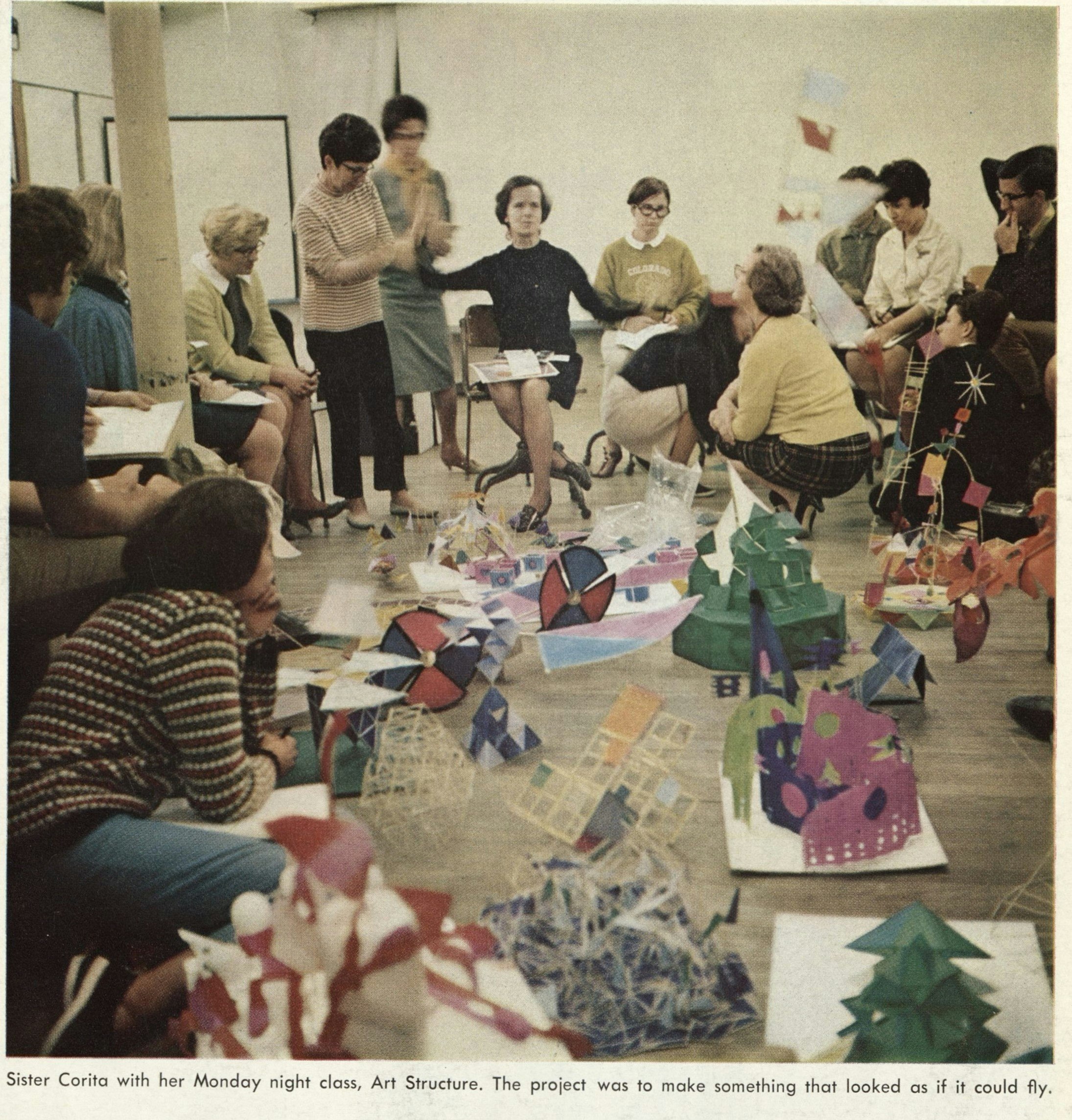
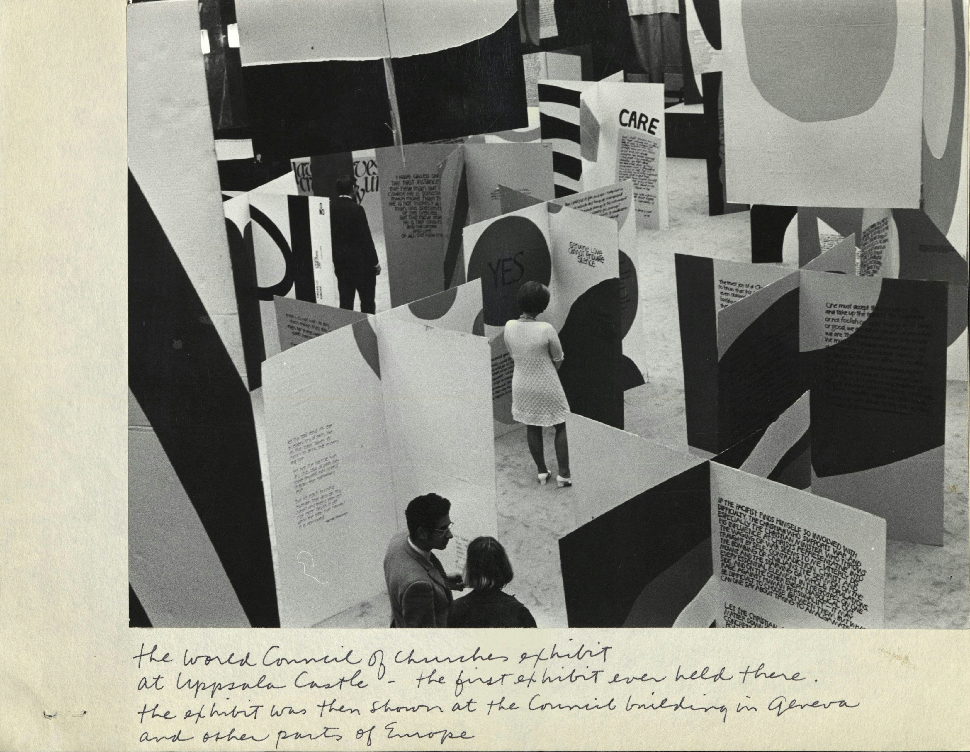
Kent’s teaching was closely related to her artistic output. From 1947 to 1968, Kent taught in the Immaculate Heart College art department, becoming chair in 1964. With a style at once playful and rigorous, Kent encouraged her students to look closely at the urban and cultural landscape surrounding them in Los Angeles for inspiration. She also gave notoriously difficult assignments, such as drawing 100 items from the college’s folk art collection or assembling books that used a wide variety of media, including collage, painting, ink drawing, screenprinting, and handwritten text. Kent often collaborated with students to produce large-scale installations such as “Survival With Style” and the World Council of Churches exhibit, composed of cardboard boxes and panels that students covered with screenprints and assembled into towering structures under Kent’s direction.

Process
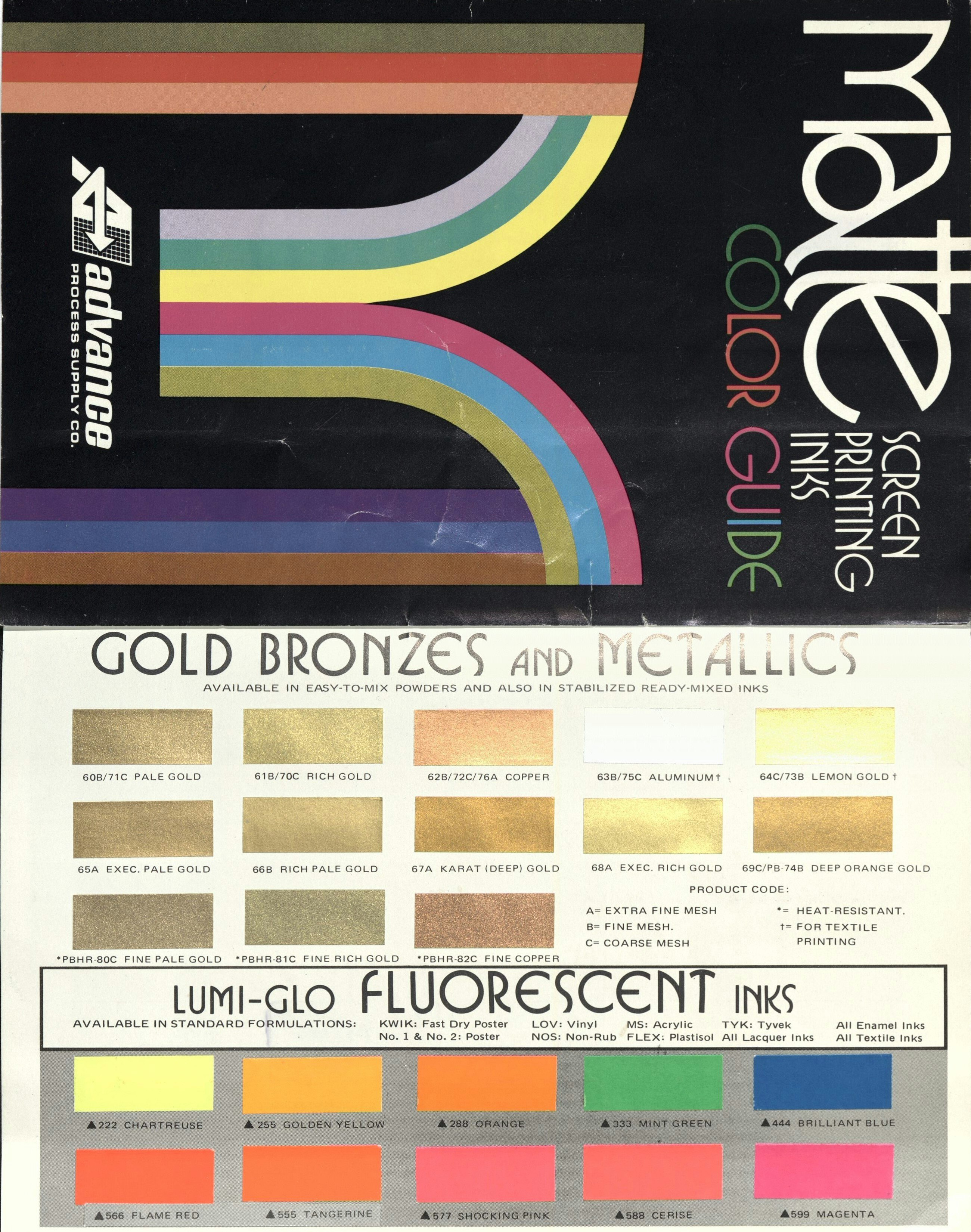
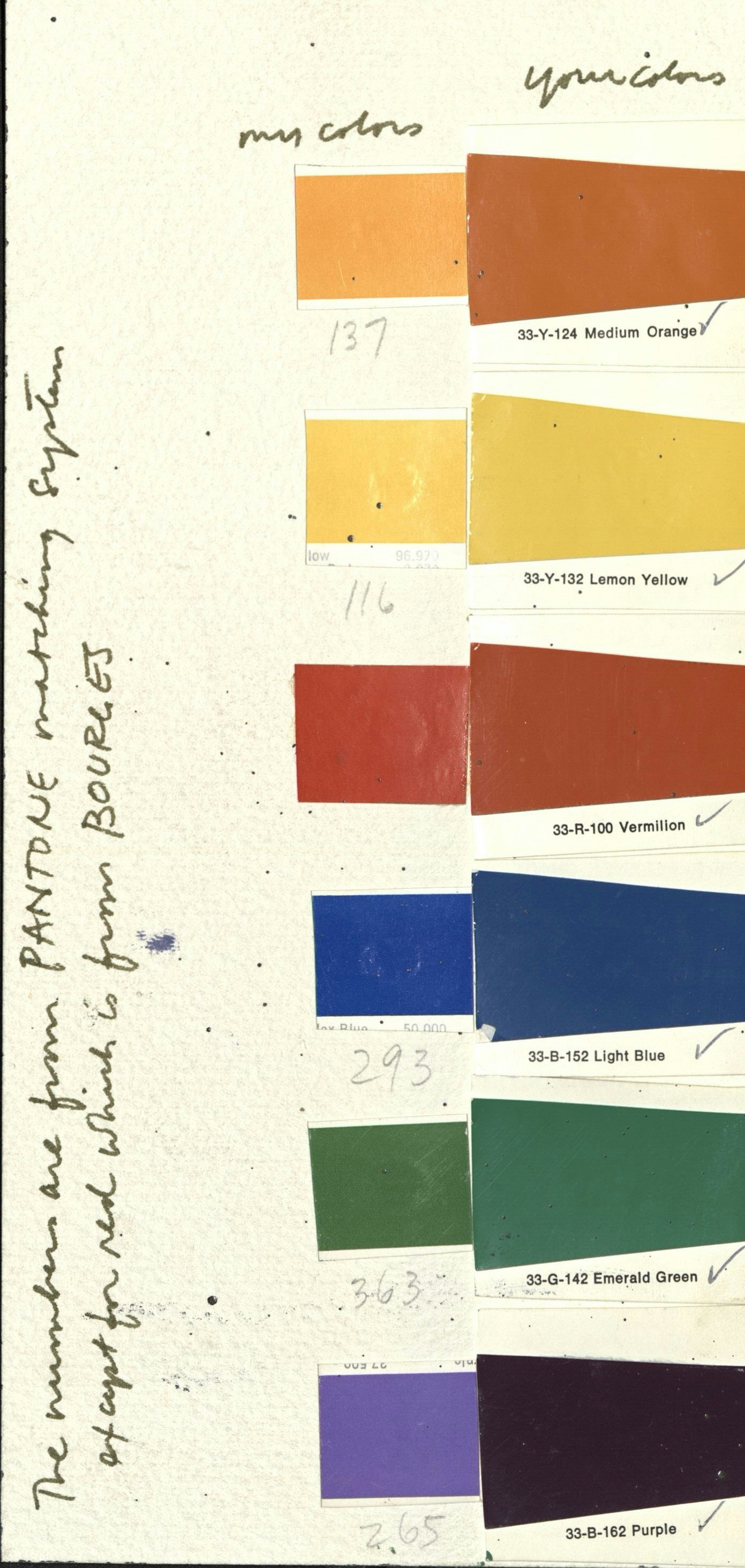
Serigraphy is a medium that spans commodity culture and fine art, an inexpensive, democratic form of artistic production that also requires great skill to execute. Until 1967, Kent produced all of her prints in the Immaculate Heart College screenprinting workshop during a three-week period every August with the help of students and other nuns. That year she began to work with the professional printing house Hambly Studios. Although she no longer executed the printing herself, she was still very much engaged in the process. A note to her printer reads, “Can you send me transparent + opaque samples before you print?”
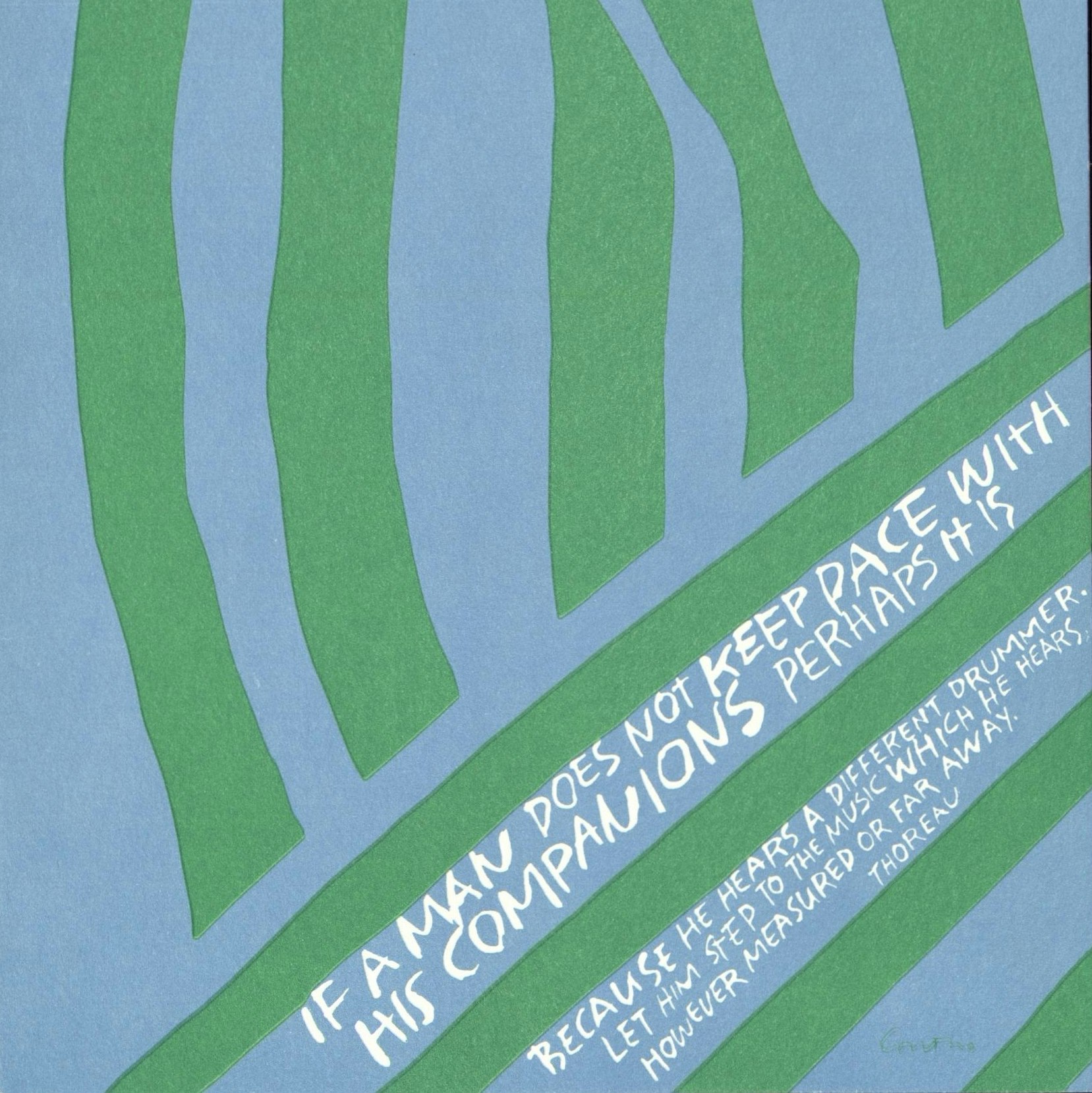
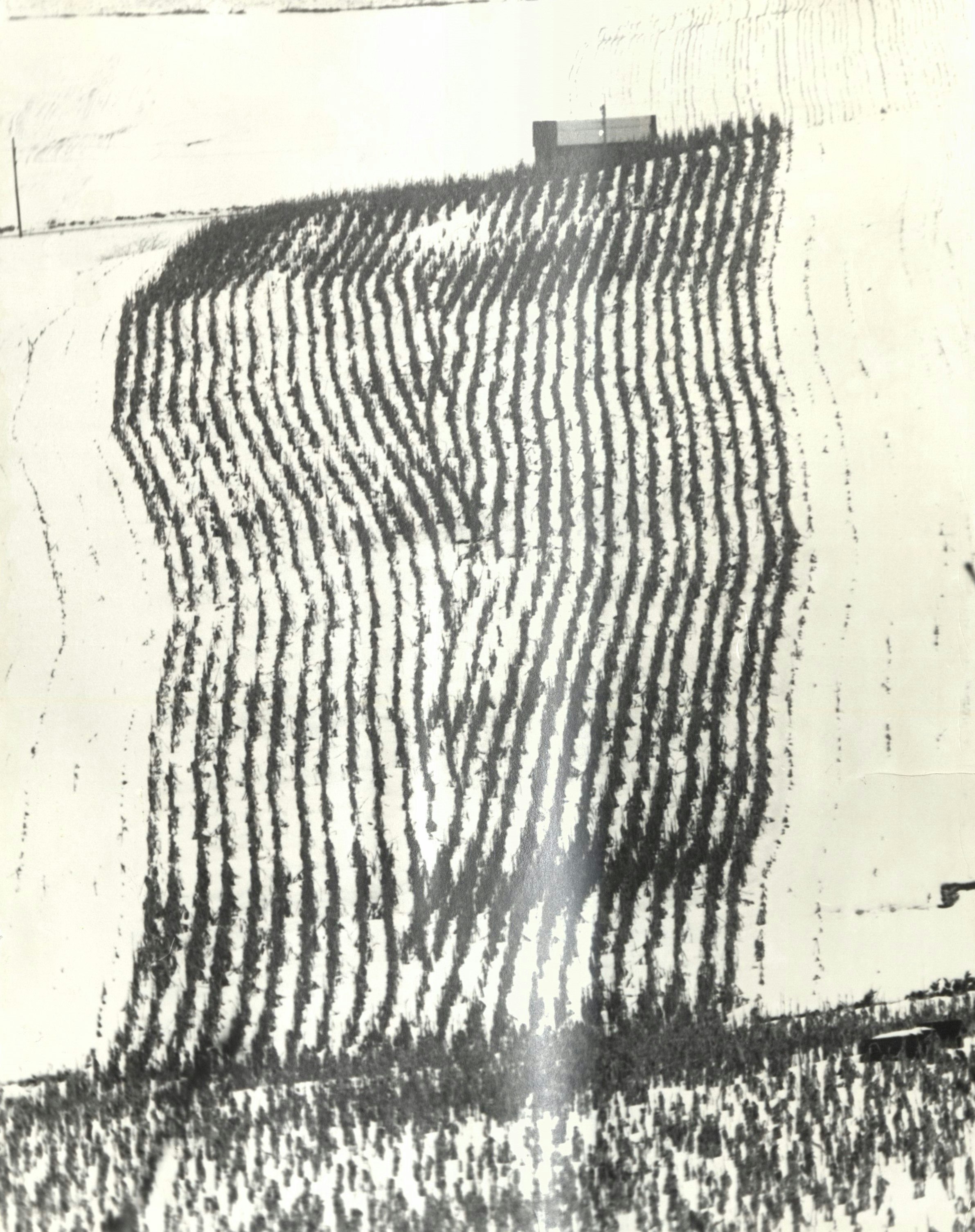
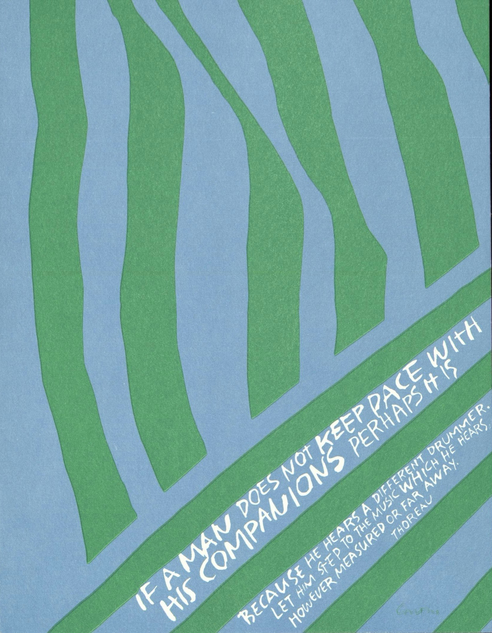
Close looking was one of the pillars of Kent’s teaching and artistic process. Kent almost always carried a camera and collected photographs of forms and motifs that inspired her—from the parallel lines of trees on a hillside or the shadow cast by a banister to the orange burst of a blooming crocus. These images appear in a number of her works, along with texts taken from a wide range of sources. In the prints below, Kent cites adapted religious language, her colleague Sister William, and Henry David Thoreau. Also in 1967, Kent began to experiment with the fluorescent inks popularized by psychedelic posters, suggesting another way in which her art was in continual conversation with contemporary cultural trends.
By 1970, Kent’s work had undergone a dramatic transformation. No longer immersed in teaching and communal religious life, Kent’s prints became less bold and graphic, relying on softer colors rather than florescent hues and replacing the lettering and logos central to her earlier works with expressive depictions of nature and painterly shapes.


Career
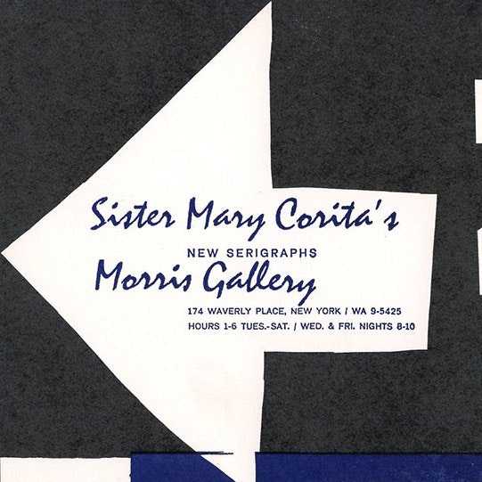
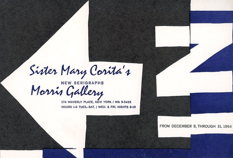
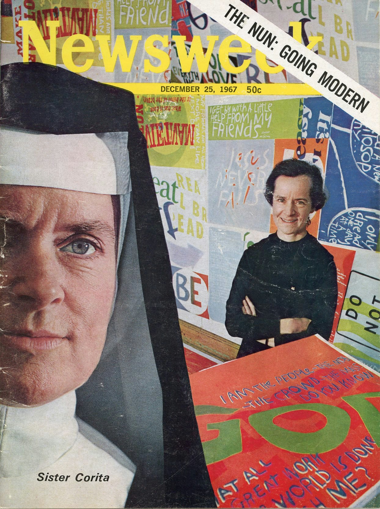
By the mid-1960s Kent was well-known for her pop art prints, and she appeared on the cover of Newsweek in December 1967. Kent began to exhibit her serigraphs in the early 1950s, going on to have solo shows at galleries across the country, including an annual winter show at the Morris Gallery in Manhattan’s Greenwich Village. Asked to create a mural for the Vatican Pavilion at the 1964–1965 New York World’s Fair, Kent produced a 40-foot-long banner updating the Beatitudes, the blessings pronounced by Jesus in the Sermon on the Mount, with quotes from Pope John XXIII and John F. Kennedy. Several years later, the Saturday Evening Post put the image on the cover of its Christmas issue, enclosing a copy of the banner as a Christmas gift to its readers. Kent was also asked to design the US Postal Service’s 1985 “LOVE” stamp, a tradition initiated in 1973 with the work of fellow pop artist Robert Indiana, whose LOVE prints were similar in both form and content to Kent’s work.

Commissions
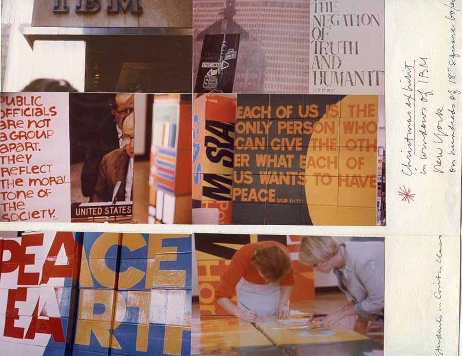
Throughout her career, Kent took a number of corporate commissions, imbuing the language of the marketplace with deeper meaning. In 1965, IBM asked Kent to design the Christmas window display for its Madison Avenue showroom. Kent and students from her lettering and design course at Immaculate Heart College created a display of 725 cardboard grocery boxes adorned with quotations, silkscreens, and photographs focused around the theme of “Peace on Earth,” the topic of a recent Papal encyclical. The display proved controversial and was subsequently revised after onlookers interpreted it as a protest against the Vietnam War. (Although Kent did not admit it at the time, their reading was correct.) Kent’s cover for Air California Magazine included the statement “Somebody up there likes us,” challenging the viewer to think about just who that “somebody” might be.
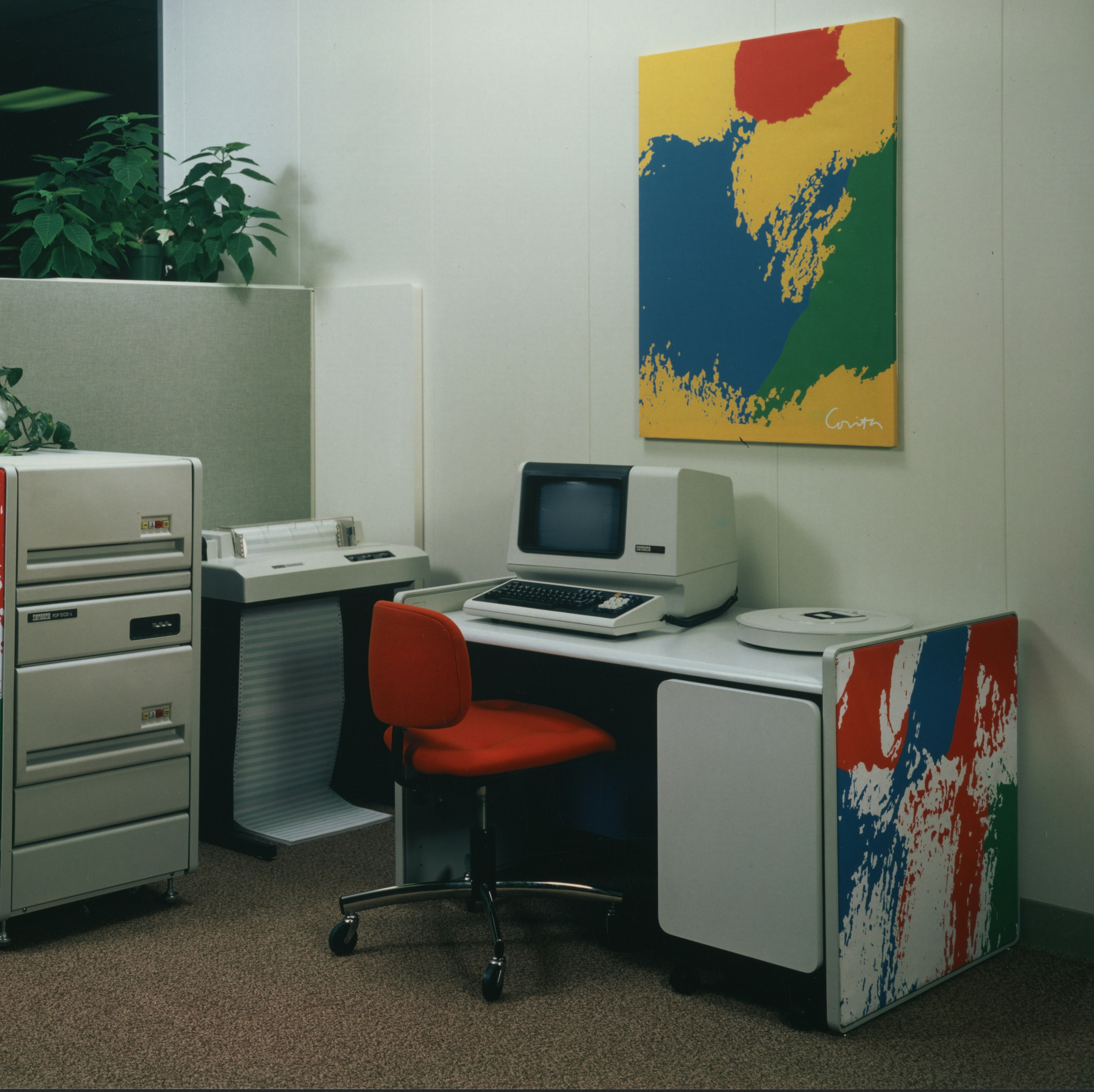
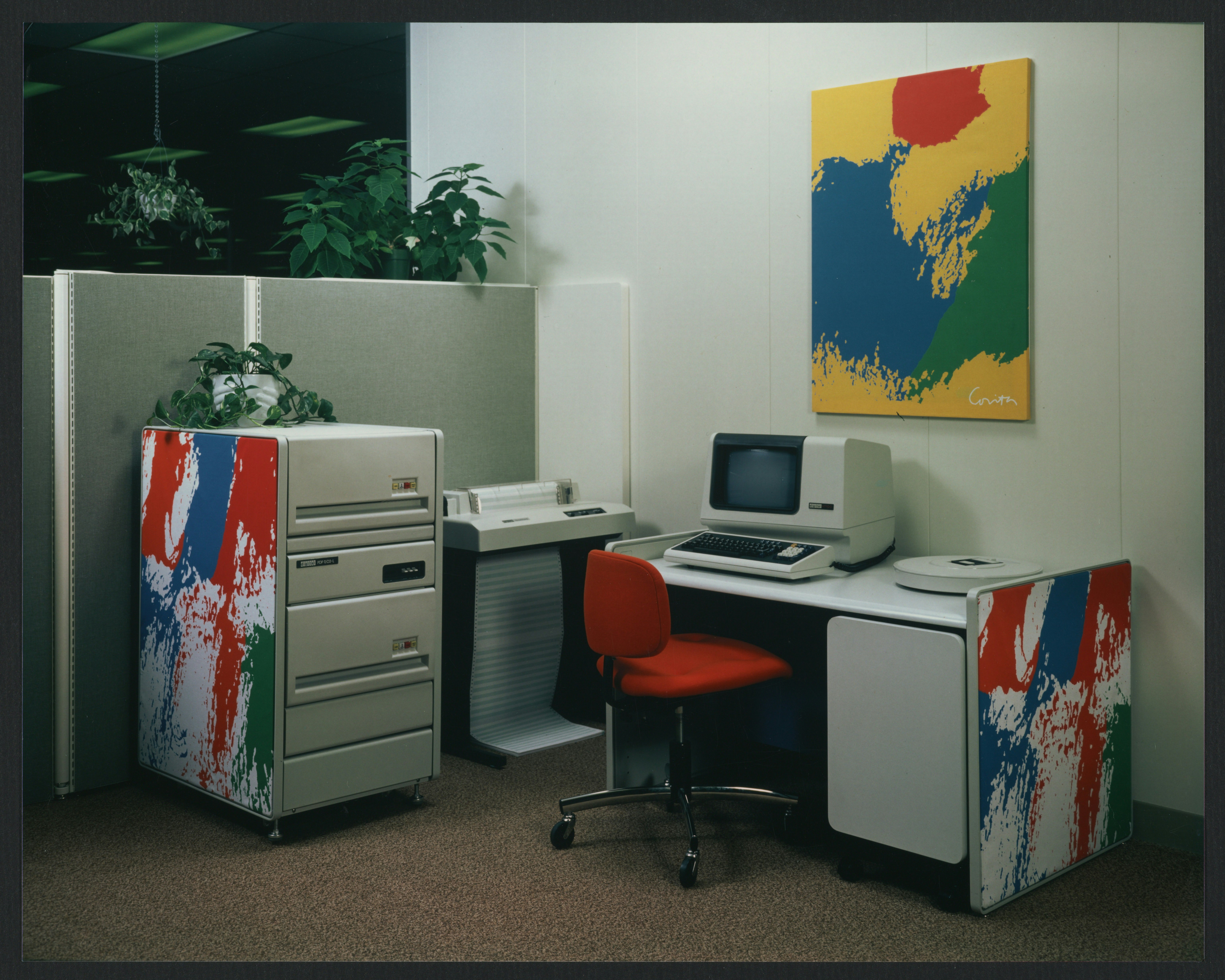
Kent’s commercial work was also in keeping with her commitment to breaking down the barriers between art and everyday life. Her designs for a series of international cookery booklets for Spice Islands drew on sayings by thinkers from each country, focused on the spiritual, even transformative, power of food. Her bright, colorful designs for the Digital Equipment Company’s office furniture brought art into the everyday space of the corporate workplace.

Religion
Kent used the language and imagery of the advertising world to comment on a modern, updated Catholic Church. “In a way all the words we need are in the ads/they can be endlessly re-sorted and reassembled/it is a huge game/a way of confronting mystery,” Kent wrote in Footnotes and Headlines: A Play-Pray Book (Herder and Herder, 1967), the illustrated prose poem in which she articulated her philosophy of faith, art, and social responsibility. Kent’s work can be viewed as a conversation between the “footnotes” of small, handwritten literary texts and the “headlines” of large, block lettering borrowed from advertisements.
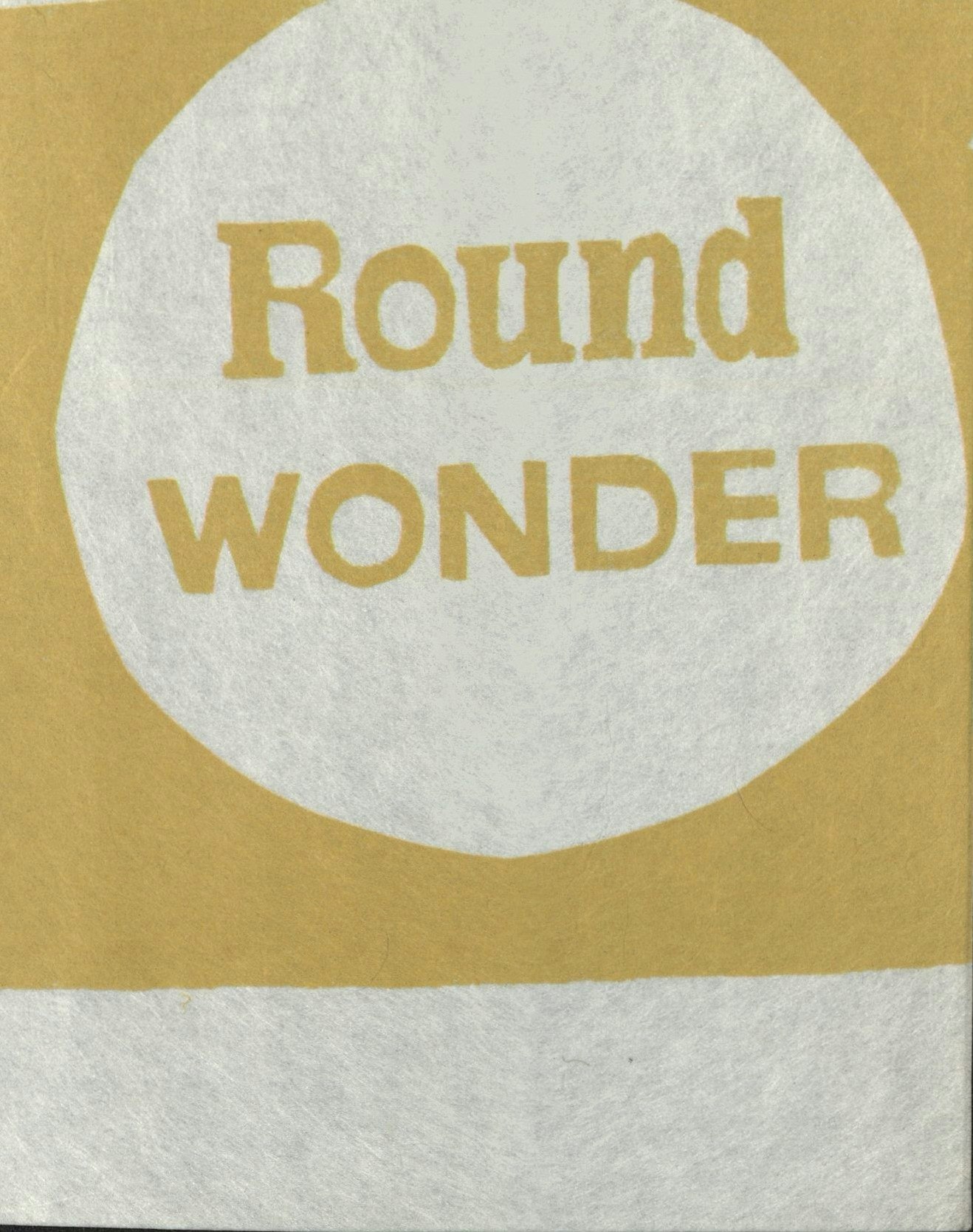
Bread—and in particular Wonder Bread—was the focus of a number of Kent’s prints. In her work, the iconic circles of Wonder Bread packaging came to stand for another kind of “wonder”: the transubstantiation of the circular communion bread into Christ’s body during the Eucharist. This playful approach to faith was also evident in an event planned by Kent, the priest Daniel Berrigan, the musician Judy Collins, and the Harvard professor Harvey Cox. “An Evening with God” took place at the Boston Tea Party, a rock music club, and featured performances, music, conversation, and an informal communion meal of store-bought bread and wine.

Activism
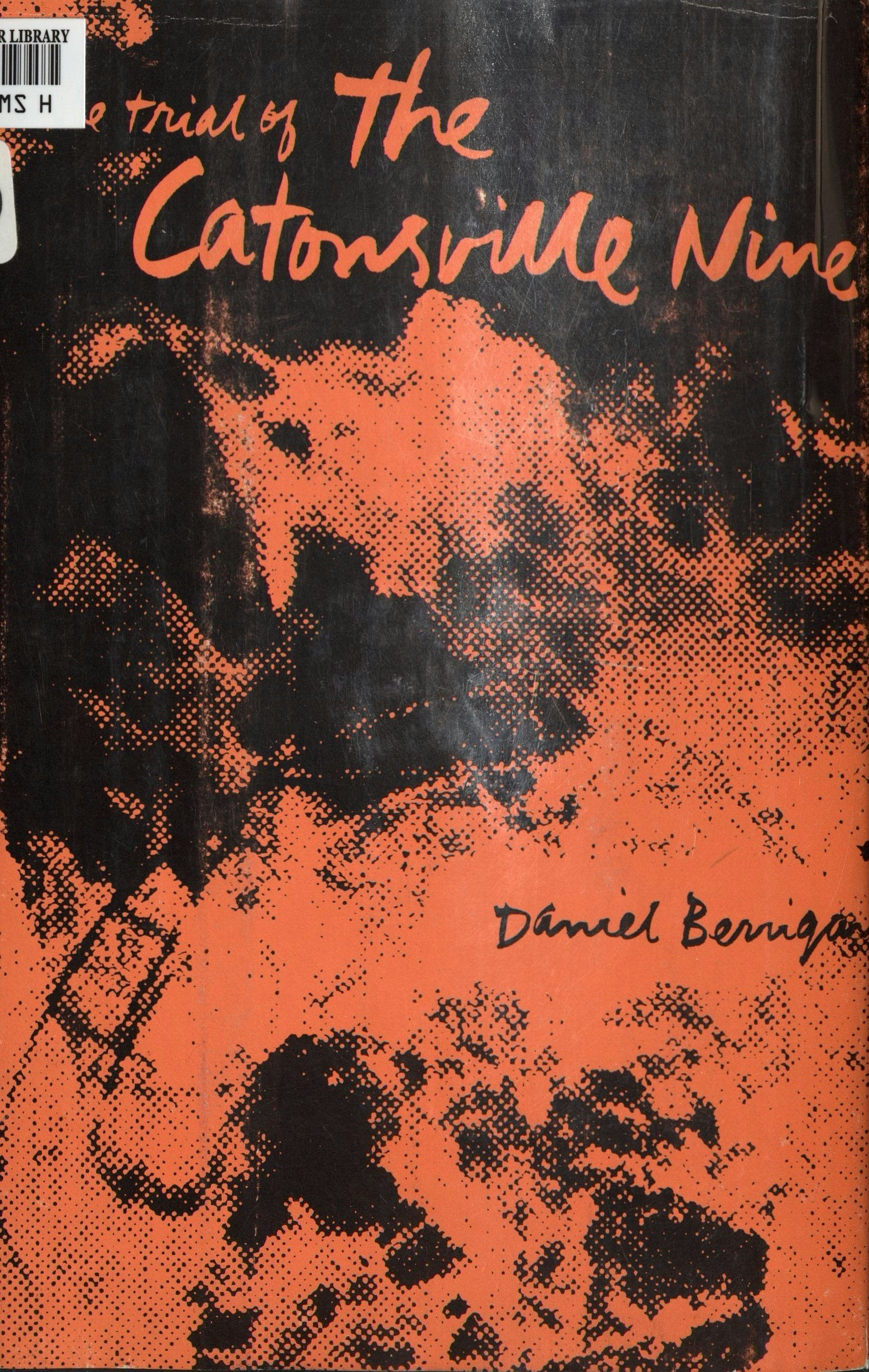
“I always felt that I couldn’t march or do political things but could help by doing my own task—posters, work with students to get them involved, etc.,” said Kent in 1979. Kent’s art, however, continually engaged with a range of social justice issues. Much of Kent’s artistic activism came out of her close friendship with Father Daniel Berrigan, a Jesuit priest best known for his radical antiwar activism. Kent and Berrigan carried on an extensive correspondence and collaborated on a number of projects. She designed the covers for many of Berrigan’s books, including The Trial of the Catonsville Nine (Beacon Press, 1970), his free-verse play about his trial and conviction for burning draft files with napalm at the Catonsville, Maryland, draft board in 1968. Berrigan penned the introduction for Kent’s book Footnotes and Headlines, and she used both his published writings and personal letters in numerous prints.
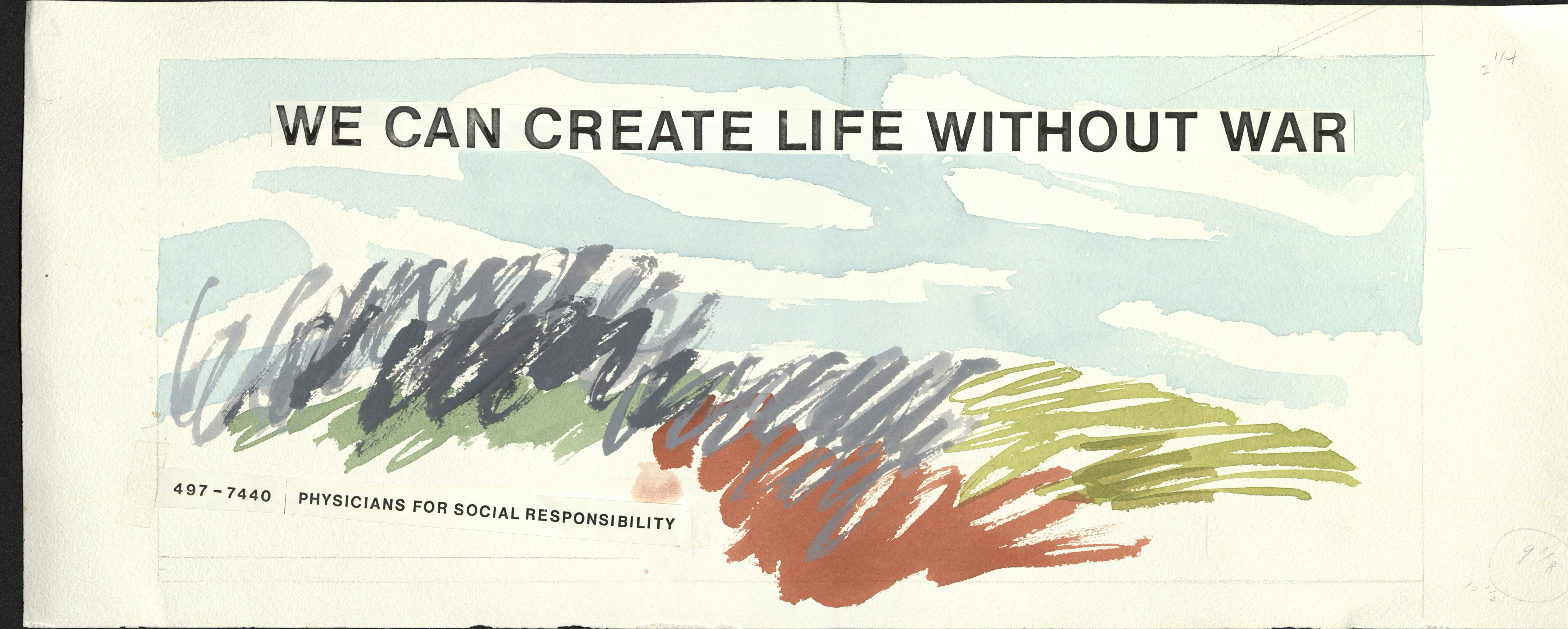
Kent created artwork for social justice and antiwar organizations, from large-scale billboards and posters to slogan buttons. She designed several billboards for the group Physicians for Social Responsibility, emblazoned with the invocation, “We can create life without war.” As part of her appropriation and transformation of the medium of advertising, Kent claimed billboards—often seen as commercialistic eyesores—as a medium for both art and protest.


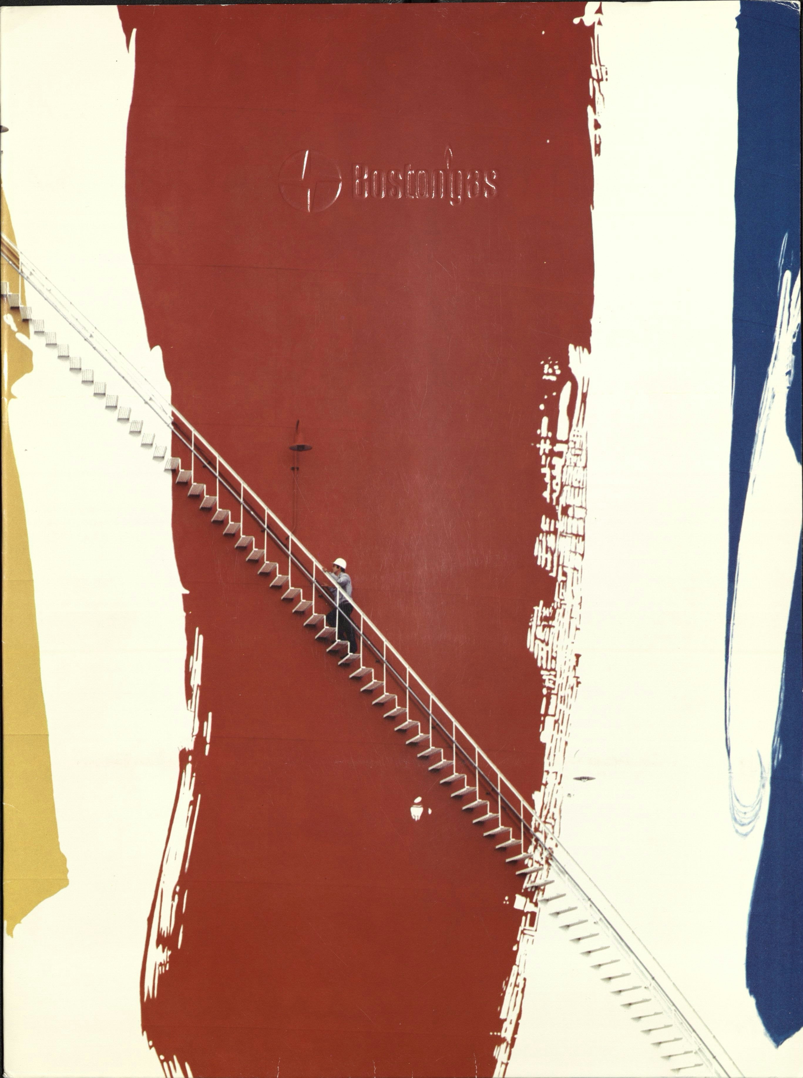
Gas Tank
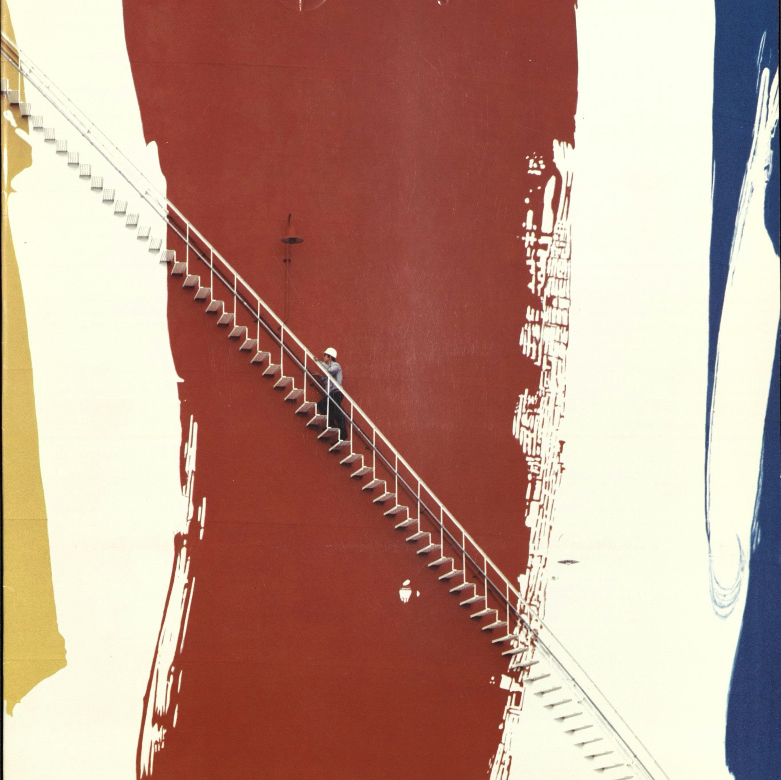
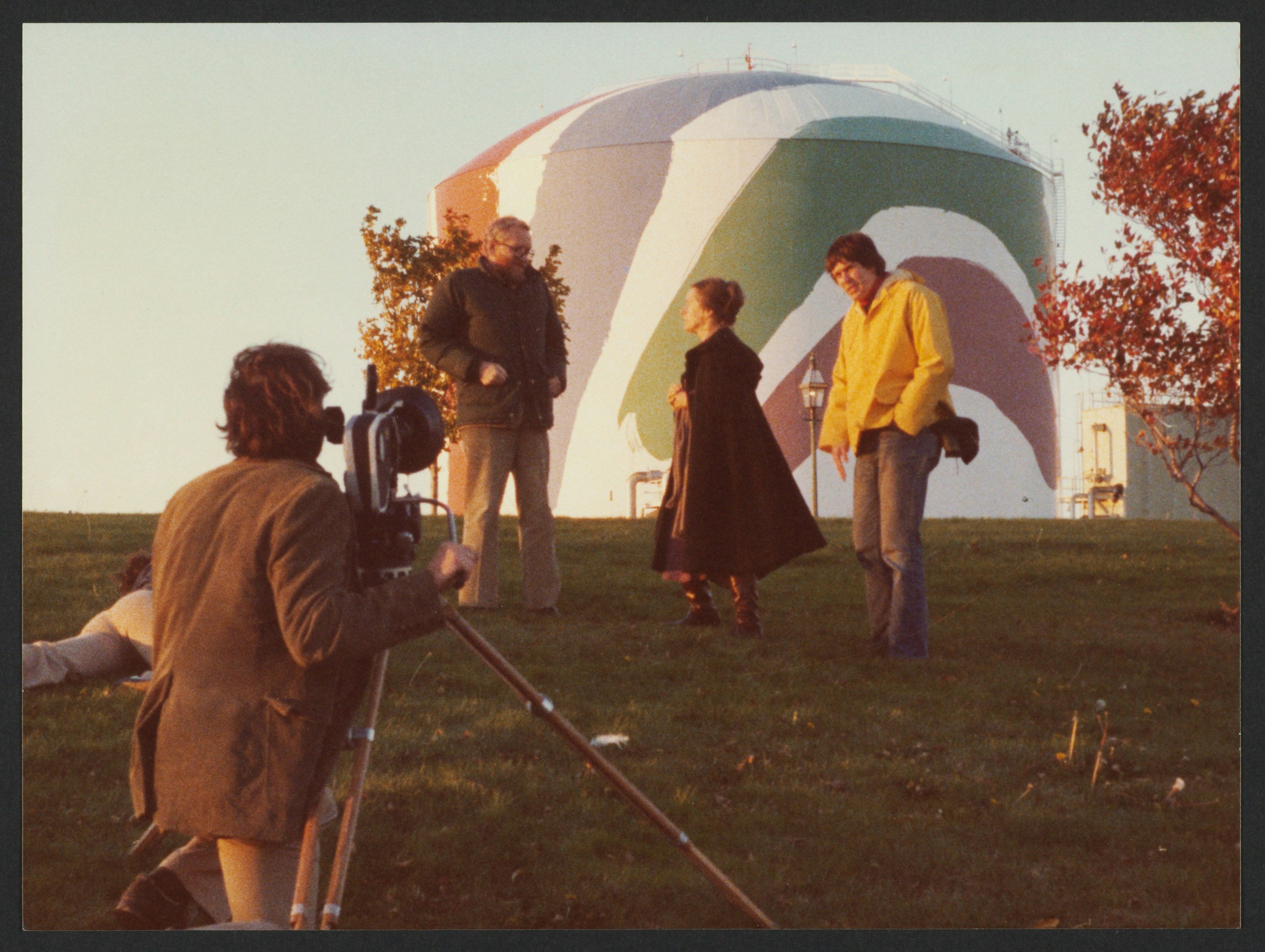
In 1971, the Boston Gas Company commissioned Kent to design her largest public art project, the exterior of a massive gas tank situated along Interstate 93. Kent executed rough brushstrokes in rainbow hues on a seven-inch-high model, after which professional sign painters transferred the composition onto the 150-foot-tall tank. Kent’s inspiration for Rainbow Swash was varied. A Morris Lewis stain painting she tore from a magazine hints at her visual sources, as does a photograph of a rainbow overlapping an image of a dove. For Kent, the rainbow also had a deeply spiritual meaning. She produced several prints inscribed with a text from Genesis that proclaims the rainbow as a sign of God’s covenant with humankind. In more secular language, Kent called the rainbow “a sign of hope that urges you to go on.” Boston Gas used the iconic tank in their promotional materials, creating fliers, folders, and even paint chip paperweights. The tank provoked controversy in Boston after some believed they saw a profile of Ho Chi Minh in the blue stripe, a charge that Kent always denied.


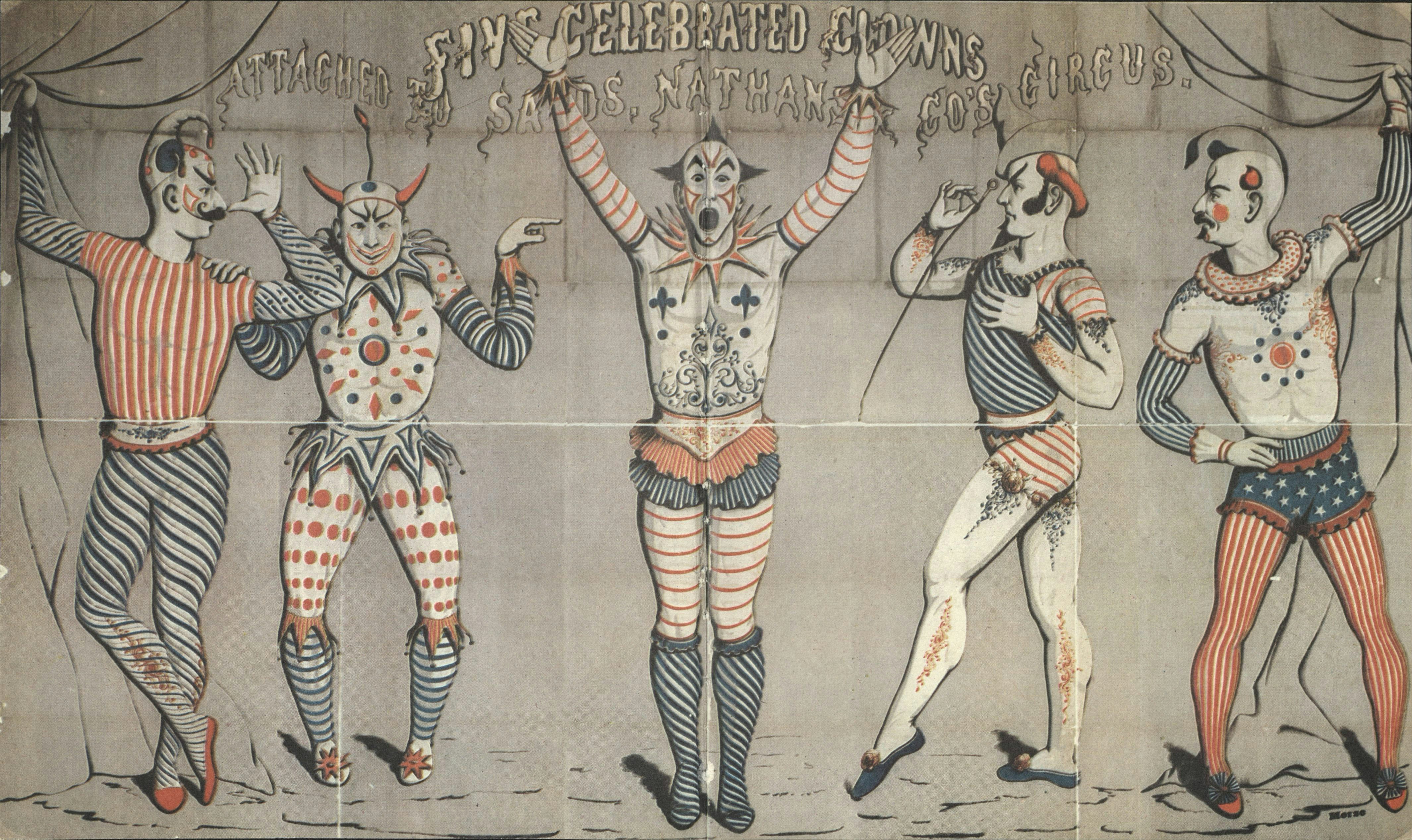
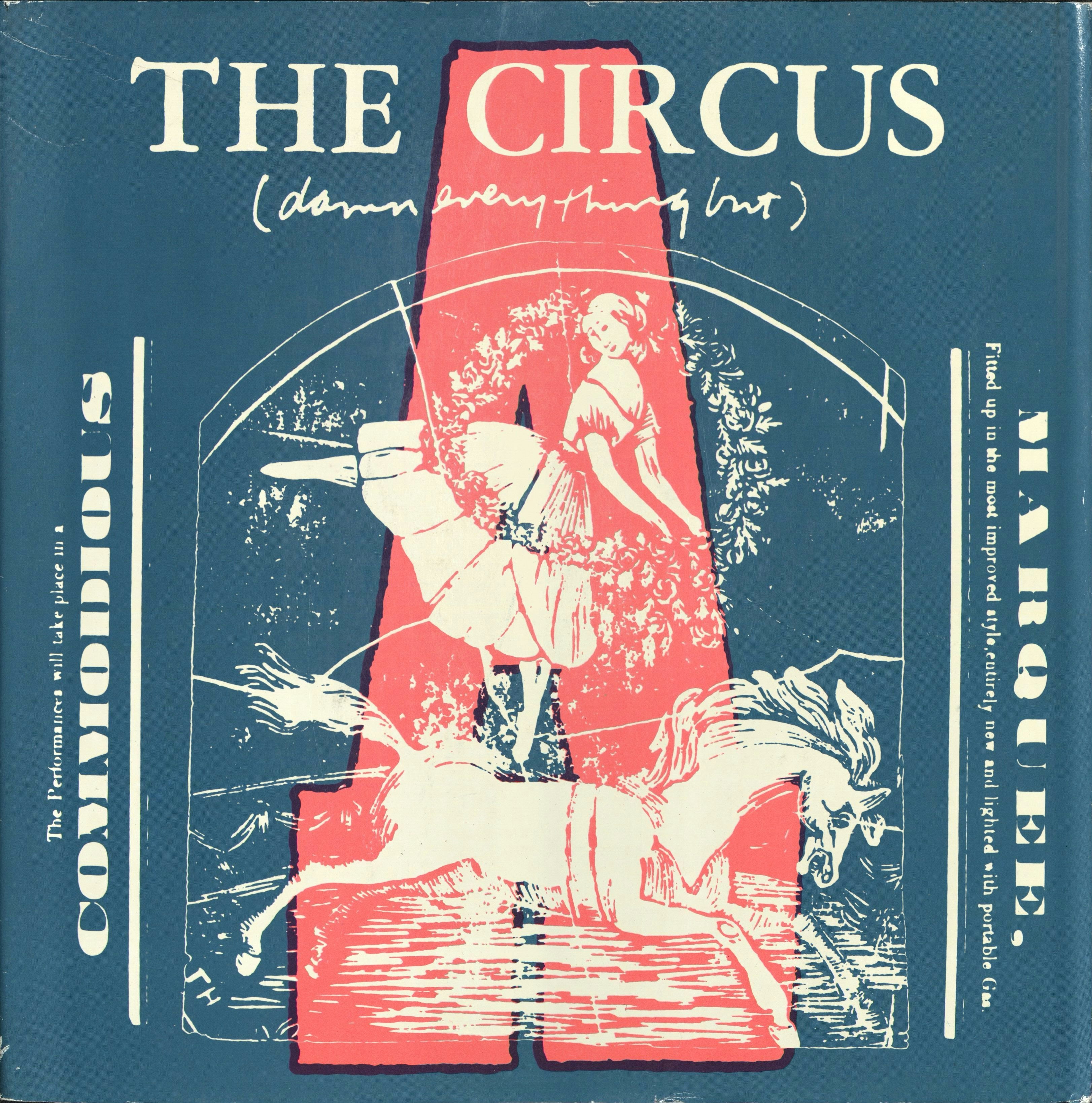
Circus
In 1968, Kent made several series of prints illustrating the 26 letters of the alphabet. Although she was long interested in lettering and typeface as art forms, a Hasidic story that Kent often quoted suggests a religious meaning as well: “He repeated the letters of the alphabet over and over beseeching the Almighty to arrange them into the appropriate words of the prayers.” Kent’s circus-themed prints drew on materials she saw at the Ringling Museum of the American Circus as well as in 19th-century American advertisements. She was also inspired by a line from E.E. Cummings—“Damn everything but the circus!”—which Kent used on a number of prints. In 1970, she incorporated the prints into a book, which she titled Damn Every Thing but the Circus: A Lot of Things Put Together (Holt, Rinehart and Winston, 1970). An opening at the Botolph Group art gallery in Boston’s Back Bay, owned by Kent’s longtime friend and art dealer Celia Thaxter Hubbard, celebrated its release.